MAIN SECTION
Dietician & Nutrition Coach in Warsaw
EAT HEALTHY AND ENJOY
Justyna was preparing to open her own nutrition practice full of passion, commitment and substantive knowledge in the field of nutrition.
She decided to invest her valuable time in matters strictly related to her expertise, thus she commissioned us - Imagenation Design - professionals in this field, to carry out the visual identity design of her new company.
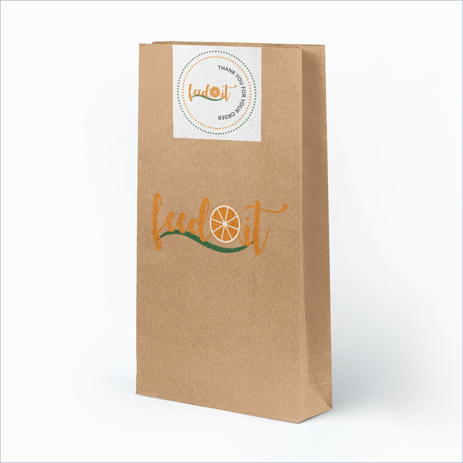
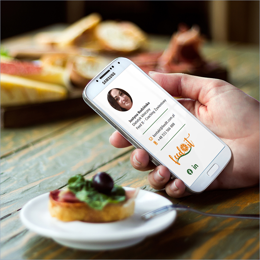
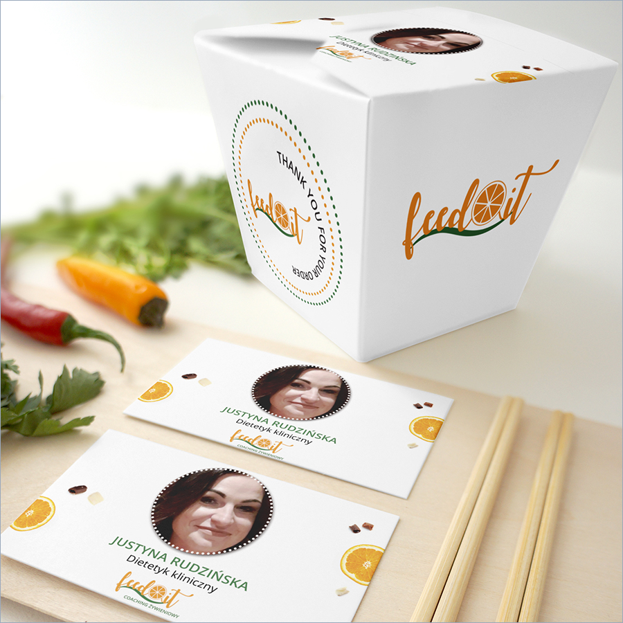
Our task was to design a brand that would have a professional tone - of course - but above all, be friendly and appealing to her potential clients.
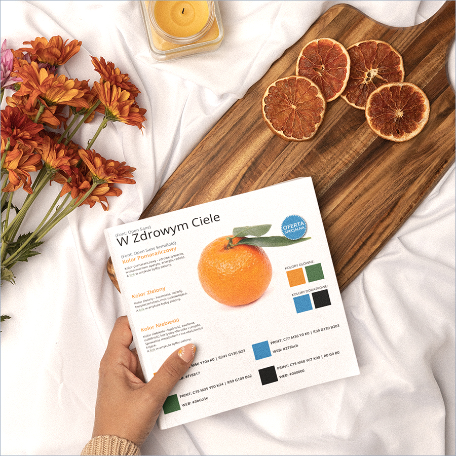
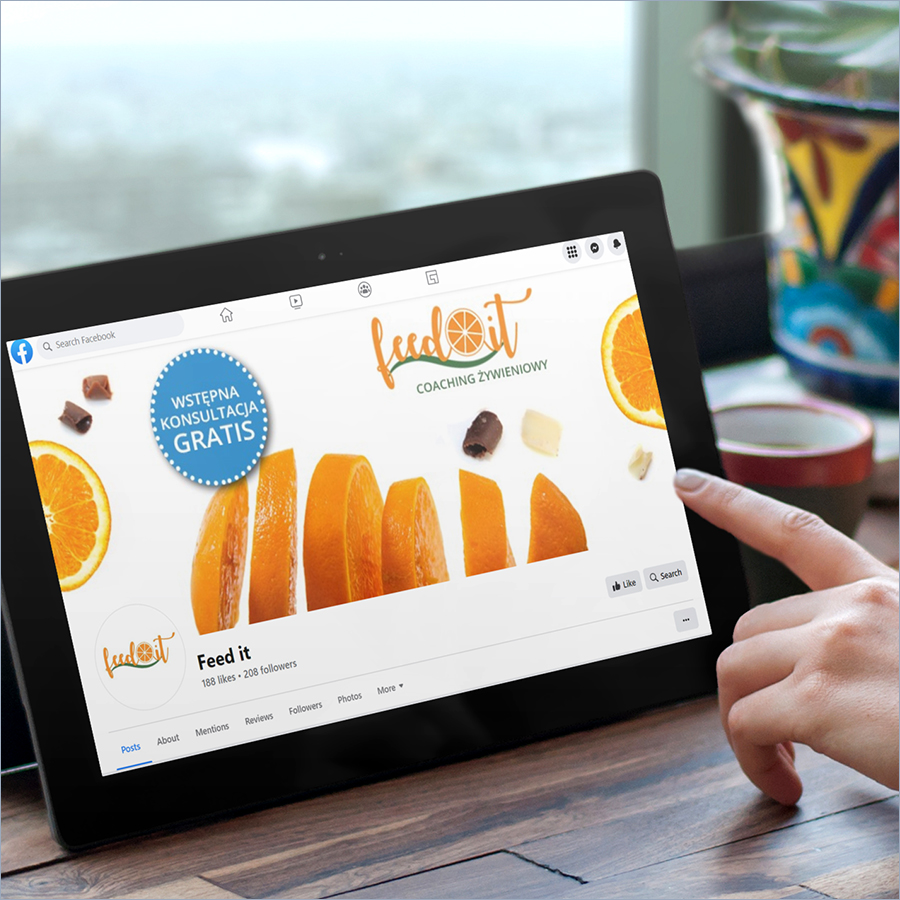
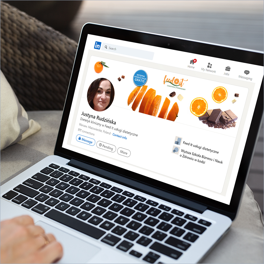
Hence the warm and cheerful orange colour, wonderfully contrasting with green - the main colour of nature (and a lettuce), along with cheekily used chocolate elements in the visuals. Chocolate?! In a diet!?! Who would have thought!
It was important to Justyna that the initial contact with her brand didn't discourage clients with an image of solely lettuce and ice cubes - translating to draconian diets, but instead conveyed the important truth that the key to success is balance - both in diet and in life!
The colour blue - chosen as a highlight for her special offers and other important announcements - not only contrasts perfectly with the rest, but also fits into the overall colour palette.
The selected font is uncomplicated, yet elegant and practical - much like her entire brand: colourful, customer-friendly, and seasoned with world-class expertise.


